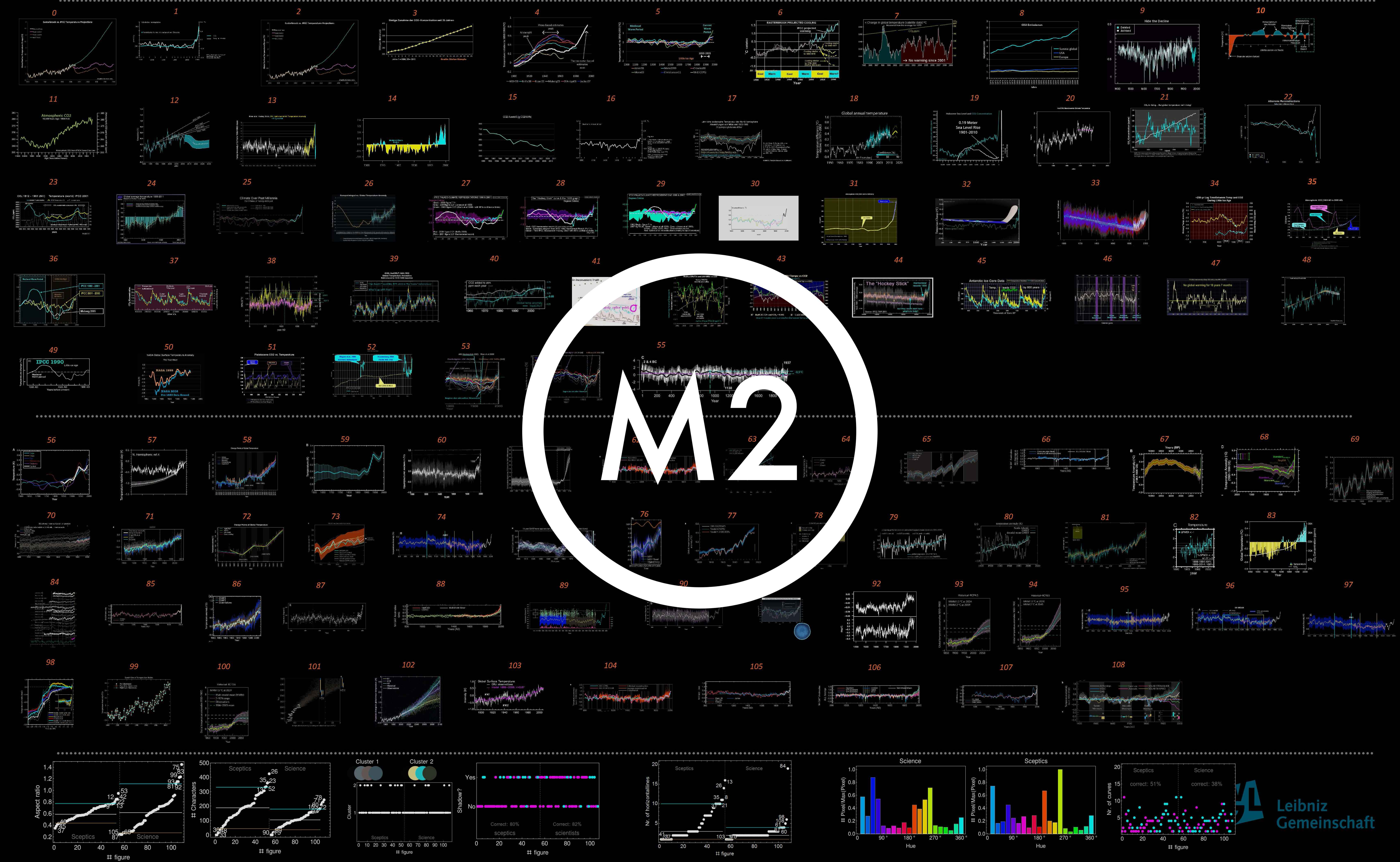
Are there differences between the graphics of climate change deniers in online blogs and the graphics of climate-related governmental institutions or bodies and the IPCC on a formal level? This question was the starting point for an image comparison using quantitative as well as qualitative methods. The objective was to find out more about the image content of temperature representation on the one hand, and more about computer-based image analysis methods on the other.
As a concrete result of the study, we were able to find formal and semiotic criteria that allow us to distinguish curve graphs of climate change denial blogs from research-related reference groups. Keeping in mind that these results need to be reflected critically, the paper presents the potentials and limitations of methods of digital humanities in image research: We show and reflect on how questions can be translated or formalized in the combination of methods and how comparative criteria, especially image similarity, change in the process.
Research report will be released soon.